Front Cover Plan
One example of a magazine I may attempt to recreate is GQ:

Another magazine which I may try to recreate is Drapers, on the account of it being a street-wear fashion magazine:


2) Select your chosen magazine to create a new edition for and explain the thinking behind your choice.
I have chosen to recreate Drapers as i believe that magazine is the most relatable to a teenage audience and due to the strong connection Drapers magazine have with daily fashion therefore teenagers can be very relatable to this magazine and i can recreate the magazine well enough for audiences to feel interacted with the audience. With GQ I believe their audience is of a older generation therefore may be hard for m,e to aim my magazine cover towards them.
3) Find three different front covers for your chosen magazine and embed them in your blog post. Analyse the fonts, colours and typical design. What is the language or writing style? How are the cover lines presented? You need to become an expert in the design and construction of this magazine and its branding.


Another magazine which I may try to recreate is Drapers, on the account of it being a street-wear fashion magazine:

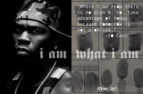
My third option i could attempt to recreate for this practical task is XXL on the account of it being a music magazine:
I have chosen to recreate Drapers as i believe that magazine is the most relatable to a teenage audience and due to the strong connection Drapers magazine have with daily fashion therefore teenagers can be very relatable to this magazine and i can recreate the magazine well enough for audiences to feel interacted with the audience. With GQ I believe their audience is of a older generation therefore may be hard for m,e to aim my magazine cover towards them.
- The fonts are quite modern an sans serif to give the serious and instense effect
- The colours include a lot of white, with one other accent colour which seems to match with something the main attraction is wearing/using, e.g.
- The central image is almost always in the centre of the canvas, almost to impose a position of power and masculinty, furthermore, they are usually covering the GQ logo in some sort of way, almost to display the power and importance of the central image.
- The main flash is made prominent through sizing and being made bold.
- The colour font of the Title tends to match the colour of the main flash with the central image between that does not take too much away from the magazine as a whole.
The fonts used by Drapers provide a modern and enticing feel as the use of San serif font makes the magazine feels serious as well as elements of futuristic.
Comments
Post a Comment